


🎉 Enjoying this package? Consider sponsoring me on GitHub or buying me a beer.
This is the documentation for v2 but the latest version is v4. You can switch versions in the menu on the left/at the top. Check your current version with the following command:
composer show rappasoft/laravel-livewire-tables
Configurable Areas
There are certain areas of the datatable as of v2.3 where you can include your own view files. This is good for adding additional functionality to the toolbar, for example.
Available Methods
setConfigurableAreas
You can use the setConfigurableAreas method to set the areas that you want to be configurable.
1public function configure(): void 2{ 3 $this->setConfigurableAreas([ 4 'before-tools' => 'path.to.my.view', 5 'toolbar-left-start' => 'path.to.my.view', 6 'toolbar-left-end' => 'path.to.my.view', 7 'toolbar-right-start' => 'path.to.my.view', 8 'toolbar-right-end' => 'path.to.my.view', 9 'before-toolbar' => 'path.to.my.view',10 'after-toolbar' => 'path.to.my.view',11 'before-pagination' => 'path.to.my.view',12 'after-pagination' => 'path.to.my.view',13 ]);14}Note: Only specify the keys you are actually implementing, otherwise you may get uneven spacing.
setHideConfigurableAreasWhenReorderingStatus
Defaults to true, set whether or not configurable areas are hidden during reordering.
1public function configure(): void2{3 $this->setHideConfigurableAreasWhenReorderingStatus(true);4 $this->setHideConfigurableAreasWhenReorderingStatus(false);5}setHideConfigurableAreasWhenReorderingEnabled
Hide configurable areas when reordering.
1public function configure(): void2{3 // Shorthand for $this->setHideConfigurableAreasWhenReorderingStatus(true)4 $this->setHideConfigurableAreasWhenReorderingEnabled();5}setHideConfigurableAreasWhenReorderingDisabled
Show configurable areas when reordering.
1public function configure(): void2{3 // Shorthand for $this->setHideConfigurableAreasWhenReorderingStatus(false)4 $this->setHideConfigurableAreasWhenReorderingDisabled();5}Passing Parameters
You can pass parameters to configurable areas that come from your mount method or any other service by proving an array:
1public function configure(): void 2{ 3 $this->setConfigurableAreas([ 4 'toolbar-left-start' => [ 5 'path.to.my.view', [ 6 'param1' => $this->user_id, 7 'param2' => resolve(MyService::class)->getThing($this->user_id), 8 ], 9 ],10 ]);11}Example View
Example dropdown for the toolbar:
1@aware(['component']) 2 3@php 4 $theme = $component->getTheme(); 5@endphp 6 7@if ($theme === 'tailwind') 8 <div class="w-full mb-4 md:w-auto md:mb-0"> 9 <div10 x-data="{ open: false }"11 @keydown.window.escape="open = false"12 x-on:click.away="open = false"13 class="relative z-10 inline-block w-full text-left md:w-auto"14 wire:key="my-dropdown-button-{{ $component->getTableName() }}"15 >16 <div>17 <span class="rounded-md shadow-sm">18 <button19 x-on:click="open = !open"20 type="button"21 class="inline-flex justify-center w-full px-4 py-2 text-sm font-medium text-gray-700 bg-white border border-gray-300 rounded-md shadow-sm hover:bg-gray-50 focus:border-indigo-300 focus:ring focus:ring-indigo-200 focus:ring-opacity-50 dark:bg-gray-700 dark:text-white dark:border-gray-600 dark:hover:bg-gray-600"22 aria-haspopup="true"23 x-bind:aria-expanded="open"24 aria-expanded="true"25 >26 @lang('My Dropdown')27 28 <svg class="w-5 h-5 ml-2 -mr-1" x-description="Heroicon name: chevron-down" xmlns="http://www.w3.org/2000/svg" viewBox="0 0 20 20" fill="currentColor">29 <path fill-rule="evenodd" d="M5.293 7.293a1 1 0 011.414 0L10 10.586l3.293-3.293a1 1 0 111.414 1.414l-4 4a1 1 0 01-1.414 0l-4-4a1 1 0 010-1.414z" clip-rule="evenodd"></path>30 </svg>31 </button>32 </span>33 </div>34 35 <div36 x-cloak37 x-show="open"38 x-transition:enter="transition ease-out duration-100"39 x-transition:enter-start="transform opacity-0 scale-95"40 x-transition:enter-end="transform opacity-100 scale-100"41 x-transition:leave="transition ease-in duration-75"42 x-transition:leave-start="transform opacity-100 scale-100"43 x-transition:leave-end="transform opacity-0 scale-95"44 class="absolute right-0 z-50 w-full mt-2 origin-top-right bg-white divide-y divide-gray-100 rounded-md shadow-lg md:w-48 ring-1 ring-black ring-opacity-5 focus:outline-none"45 >46 <div class="bg-white rounded-md shadow-xs dark:bg-gray-700 dark:text-white">47 <div class="py-1" role="menu" aria-orientation="vertical">48 <button49 wire:click="my-action"50 wire:key="my-dropdown-my-action-{{ $component->getTableName() }}"51 type="button"52 class="flex items-center block w-full px-4 py-2 space-x-2 text-sm leading-5 text-gray-700 hover:bg-gray-100 hover:text-gray-900 focus:outline-none focus:bg-gray-100 focus:text-gray-900 dark:text-white dark:hover:bg-gray-600"53 role="menuitem"54 >55 <span>My Action 1</span>56 </button>57 </div>58 </div>59 </div>60 </div>61 </div>62@elseif ($theme === 'bootstrap-4' || $theme === 'bootstrap-5')63 <div><!-- Implement Other Themes if needed--></div>64@endifNote: If you don't specify the theme conditional, it will show up on every theme.
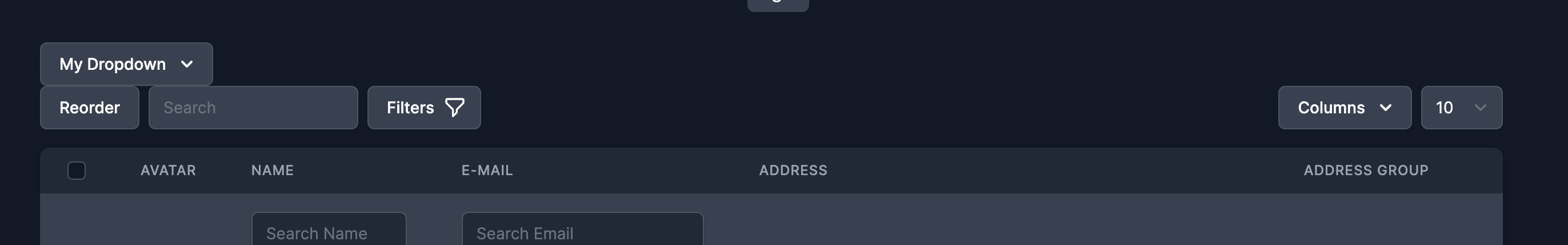
Areas
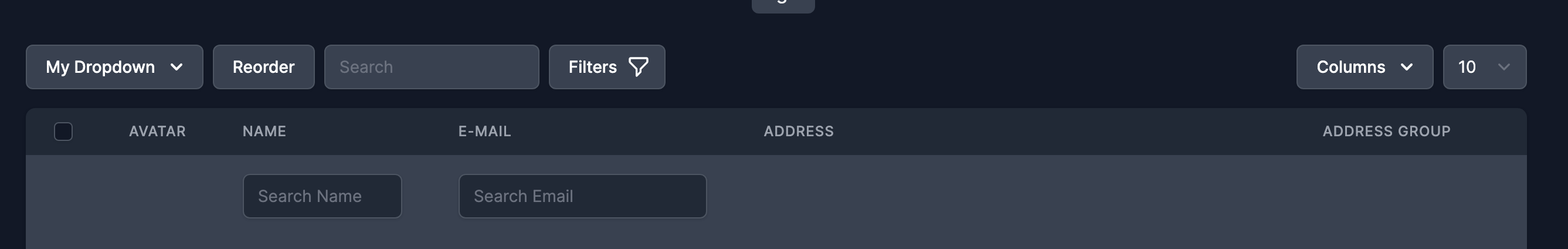
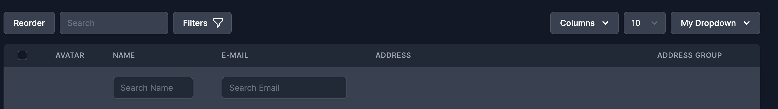
Here are the placements for the available areas:
Toolbar Left Start
Toolbar Left End
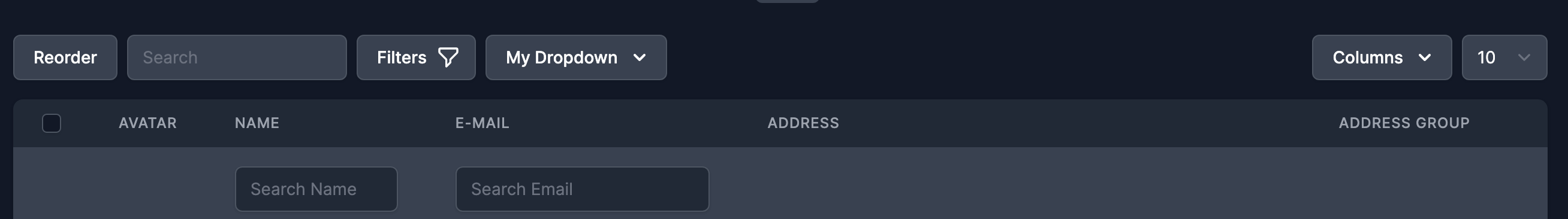
Toolbar Right Start
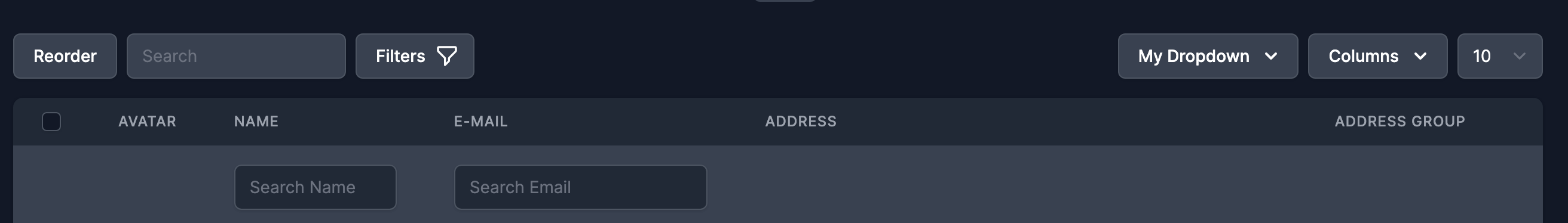
Toolbar Right End
Before Toolbar
After Toolbar

Before Pagination

After Pagination
