


🎉 Enjoying this package? Consider sponsoring me on GitHub or buying me a beer.
This is the documentation for v2 but the latest version is v4. You can switch versions in the menu on the left/at the top. Check your current version with the following command:
composer show rappasoft/laravel-livewire-tables
Other Column Types
Boolean Columns
Boolean columns are good if you have a column type that is a true/false, or 0/1 value.
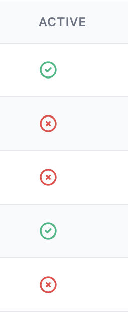
For example:
1BooleanColumn::make('Active')Would yield:
Using your own view
If you don't want to use the default view and icons you can set your own:
1BooleanColumn::make('Active')2 ->setView('my.active.view')You will have access to $component, $status, and $successValue.
To help you better understand, this is the Tailwind implementation of BooleanColumn:
1@if ($status)2 <svg xmlns="http://www.w3.org/2000/svg" class="inline-block h-5 w-5 @if ($successValue === true) text-green-500 @else text-red-500 @endif" fill="none" viewBox="0 0 24 24" stroke="currentColor">3 <path stroke-linecap="round" stroke-linejoin="round" stroke-width="2" d="M9 12l2 2 4-4m6 2a9 9 0 11-18 0 9 9 0 0118 0z" />4 </svg>5@else6 <svg xmlns="http://www.w3.org/2000/svg" class="inline-block h-5 w-5 @if ($successValue === false) text-green-500 @else text-red-500 @endif" fill="none" viewBox="0 0 24 24" stroke="currentColor">7 <path stroke-linecap="round" stroke-linejoin="round" stroke-width="2" d="M10 14l2-2m0 0l2-2m-2 2l-2-2m2 2l2 2m7-2a9 9 0 11-18 0 9 9 0 0118 0z" />8 </svg>9@endifSetting the truthy value
If you want the false value to be the green option, you can set:
1BooleanColumn::make('Active')2 ->setSuccessValue(false); // Makes false the 'successful' optionThat would swap the colors of the icons in the image above.
Setting the status value
By default, the $status is set to:
1(bool)$value === trueYou can override this functionality:
1BooleanColumn::make('Active')2 // Note: Parameter `$row` available as of v2.43 ->setCallback(function(string $value, $row) {4 // Figure out what makes $value true5 }),Different types of boolean display
By default, the BooleanColumn displays icons.
If you would like the BooleanColumn to display a plain Yes/No, you can set:
1BooleanColumn::make('Active')2 ->yesNo()Image Columns
Image columns provide a way to display images in your table without having to use format() or partial views:
1ImageColumn::make('Avatar')2 ->location(3 fn($row) => storage_path('app/public/avatars/' . $row->id . '.jpg')4 ),You may also pass an array of attributes to apply to the image tag:
1ImageColumn::make('Avatar')2 ->location(3 fn($row) => storage_path('app/public/avatars/' . $row->id . '.jpg')4 )5 ->attributes(fn($row) => [6 'class' => 'rounded-full',7 'alt' => $row->name . ' Avatar',8 ]),Link Columns
Link columns provide a way to display HTML links in your table without having to use format() or partial views:
1LinkColumn::make('Action')2 ->title(fn($row) => 'Edit')3 ->location(fn($row) => route('admin.users.edit', $row)),You may also pass an array of attributes to apply to the a tag:
1LinkColumn::make('Action')2 ->title(fn($row) => 'Edit')3 ->location(fn($row) => route('admin.users.edit', $row))4 ->attributes(fn($row) => [5 'class' => 'rounded-full',6 'alt' => $row->name . ' Avatar',7 ]),Button Group Columns
Button group columns let you provide an array of LinkColumns to display in a single cell.
1ButtonGroupColumn::make('Actions') 2 ->attributes(function($row) { 3 return [ 4 'class' => 'space-x-2', 5 ]; 6 }) 7 ->buttons([ 8 LinkColumn::make('View') // make() has no effect in this case but needs to be set anyway 9 ->title(fn($row) => 'View ' . $row->name)10 ->location(fn($row) => route('user.show', $row))11 ->attributes(function($row) {12 return [13 'class' => 'underline text-blue-500 hover:no-underline',14 ];15 }),16 LinkColumn::make('Edit')17 ->title(fn($row) => 'Edit ' . $row->name)18 ->location(fn($row) => route('user.edit', $row))19 ->attributes(function($row) {20 return [21 'target' => '_blank',22 'class' => 'underline text-blue-500 hover:no-underline',23 ];24 }),25 ]),Component Columns
Component columns let you specify a component name and attributes and provides the column value to the slot.
1// Before 2Column::make("Email", "email") 3 ->format(function ($value) { 4 return view('components.alert') 5 ->with('attributes', new ComponentAttributeBag([ 6 'type' => Str::endsWith($value, 'example.org') ? 'success' : 'danger', 7 'dismissible' => true, 8 ])) 9 ->with('slot', $value);10 }),11 12// After13ComponentColumn::make('E-mail', 'email')14 ->component('email')15 ->attributes(fn ($value, $row, Column $column) => [16 'type' => Str::endsWith($value, 'example.org') ? 'success' : 'danger',17 'dismissible' => true,18 ]),