


Enabling dark mode in Tailwind CSS
I had never implemented dark mode in Tailwind before, but it was such a breeze I decided to make it even easier for you.
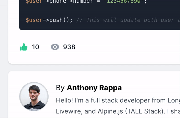
For the last 6 months or so I've been creating a "Pro" boilerplate project written in the TALL stack to go along with my popular open source version written in Bootstrap and jQuery.
I never ended up releasing it, because I couldn't figure out how I wanted to. So I just kept adding features in my spare time. I even built this Livewire Datatable Package to go along with it.
Recently I didn't know what else I wanted to do, but I ended up landing on Dark Mode since I knew it would be a challenge for me as I've never done it before.
The project itself is pretty big for a boilerplate, so I knew I'd have my work cut out for me.
Here is the path I took:
- Read the Tailwind dark-mode docs
- Figure out how to swap the styles
- Make a theme switcher
- Figure out how to swap the logo
- Add dark styles to everything
- Adding context specific tweaks
- Organize styles (optional)
It was actually pretty straight forward, It took about a week from docs-to-finish to theme (multiple times over to get something I liked) the 50 or so view files and components.
1. Read the Tailwind docs
This one seems pretty trivial, but the docs told me 95% of what I needed to know.
I knew I had to enable darkMode in Tailwinds config file:
1module.exports = {2 darkMode: 'class',3 // ...4}I went with class mode so I can toggle it myself and not rely on the prefers-color-scheme media feature.
I also knew the dark utilities would be available for most color related classes. i.e. background color, text color, border color, etc. Anything else I would have to specifically enable via the config file.
Lastly, I knew that all I needed to do was prepend my classes with dark: and they would automatically take precedence when my theme-toggler was built.
2. Figure out how to swap the styles
Although there is an example on how to swap class styles in Tailwind's docs, I thought it was a little verbose. I Googled around to find a better solution, and I pieced together the following from a couple different examples I found (I'm sorry I don't remember where I found them).
The approach I ended up going with was toggling a dark class on the html element of the page using Alpine.js.
Here is the finished result:
1<html2 x-cloak3 x-data="{darkMode: localStorage.getItem('dark') === 'true'}"4 x-init="$watch('darkMode', val => localStorage.setItem('dark', val))"5 x-bind:class="{'dark': darkMode}"6>So what's happening here?
The document is being initialized as an Alpine component. the darkMode property is being set to whether or not the dark variable is set in local storage.
Once that is set, the x-bind decides whether to give the html tag a class of dark.
The x-init listens for the value of darkMode to change, and thanks to Alpine.js V3, I can change it elsewhere and Alpine will pick up on it.
From here on out, the theme switcher below will toggle the darkMode Alpine property and the $watch will trigger to set the local storage for the next page load. It will also toggle the dark class on or off of the html tag based on the bool value of the darkMode property.
Note: I was having some issues with 'flickering' if dark mode was enabled on page load since Alpine wasn't initialized to figure out which theme to set yet. Adding x-cloak fixed that flickering issue.
3. Make a theme switcher
Now that we have the page listening for changes on when to show the styles, we need a way to actually change it.
I went with the default location of the upper right of the page to build a tiny 1-icon component to handle the change.
I ended up just using a simple Alpine button component to swap the value of darkMode:
1<button x-cloak x-on:click="darkMode = !darkMode;">2 <x-heroicon-s-moon x-show="!darkMode" class="p-2 ml-3 w-8 h-8 text-gray-700 bg-gray-100 rounded-md transition cursor-pointer hover:bg-gray-200" />3 <x-heroicon-s-sun x-show="darkMode" class="p-2 ml-3 w-8 h-8 text-gray-100 bg-gray-700 rounded-md transition cursor-pointer dark:hover:bg-gray-600" />4</button>I used the blade heroicons package for my icons.
Here's what It looks like finished:
4. Figure out how to swap the logo
The logo was the same concept, I just needed to show/hide the correct one based on the current theme:
1<img x-cloak src="{{ asset('img/logo.svg') }}" :class="{'hidden': darkMode}" {{ $attributes }} alt="{{ appName() }}" />2<img x-cloak src="{{ asset('img/logo-white.svg') }}" :class="{'hidden': !darkMode}" {{ $attributes }} alt="{{ appName() }}" />5. Add dark styles to everything
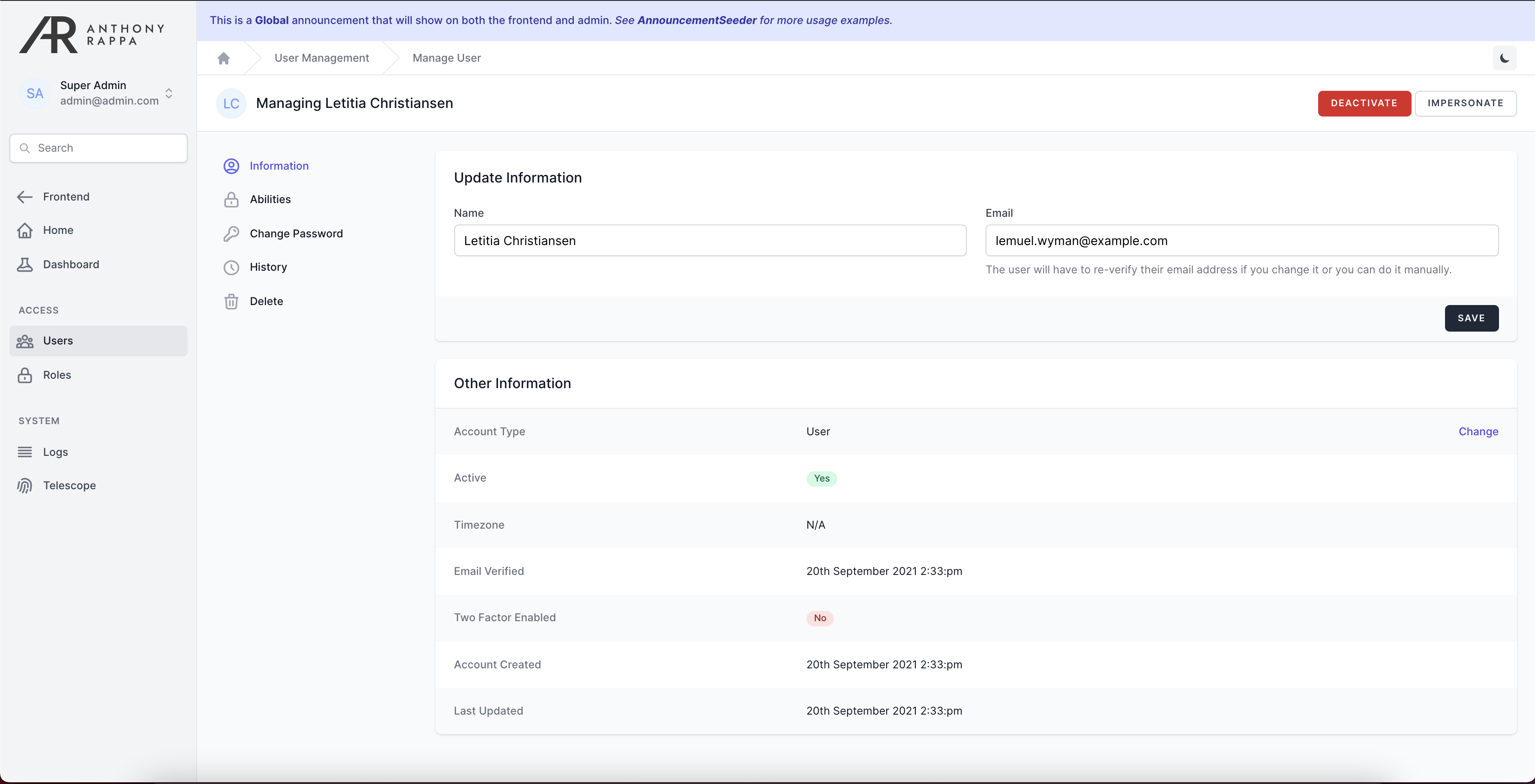
This was the most time-consuming part as I had to manually go through every file in the views folder and add dark styles where they were applicable.
I chose a combination of grays as most do. I used darkest gray (900) for the background, 800 for cards, white for most text (400 for sub text). As well as a combination of the rest for hover/focus/active states depending on the context.
I also themed all my components such as badges, alerts, notifications, etc, to look better on the dark backgrounds.
Luckily the datatable plugin I use is also mine, so I went in and made an upgrade to that to support dark mode as well.
6. Adding context specific tweaks
There was one specific spot I had trouble styling and that was on the terms and privacy policy pages. Since I'm using Jetstream for my frontend scaffolding, those pages are generated from .md files and use Tailwinds's prose feature.
I had to add some specific clauses to Tailwind's config file to get those to work right:
1theme: { 2 ... 3 typography: (theme) => ({ 4 dark: { 5 css: { 6 h1: { 7 color: theme('colors.white'), 8 fontWeight: 800, 9 fontSize: '2.25em',10 marginTop: 0,11 marginBottom: '0.8em',12 lineHeight: 1.1,13 },14 },15 ...16 },17 }),18},7. Organize styles (optional)
As a final step, I used a PHPStorm plugin called Tailwind Formatter that I ran on each file which organized the classes on each element to be consistent.
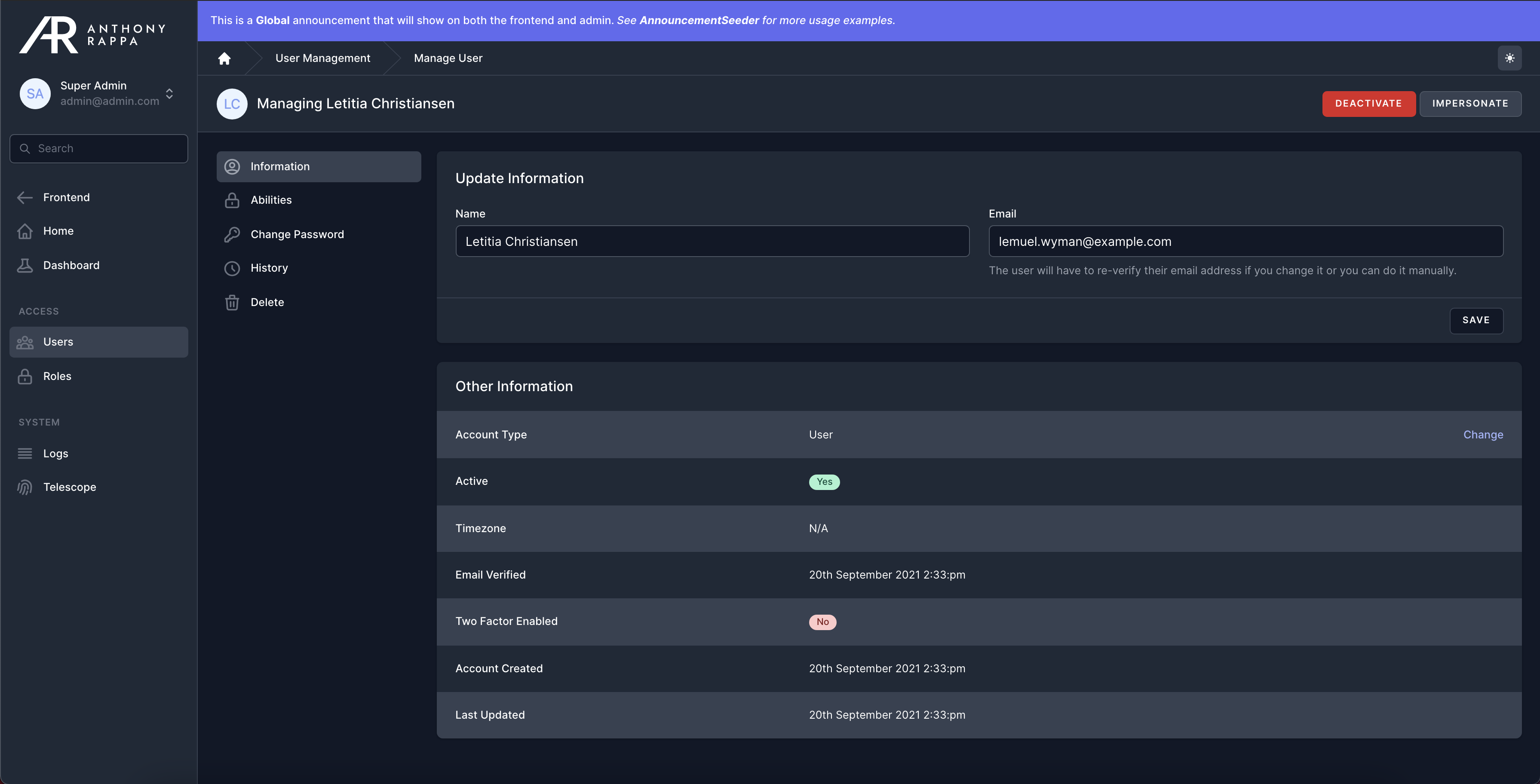
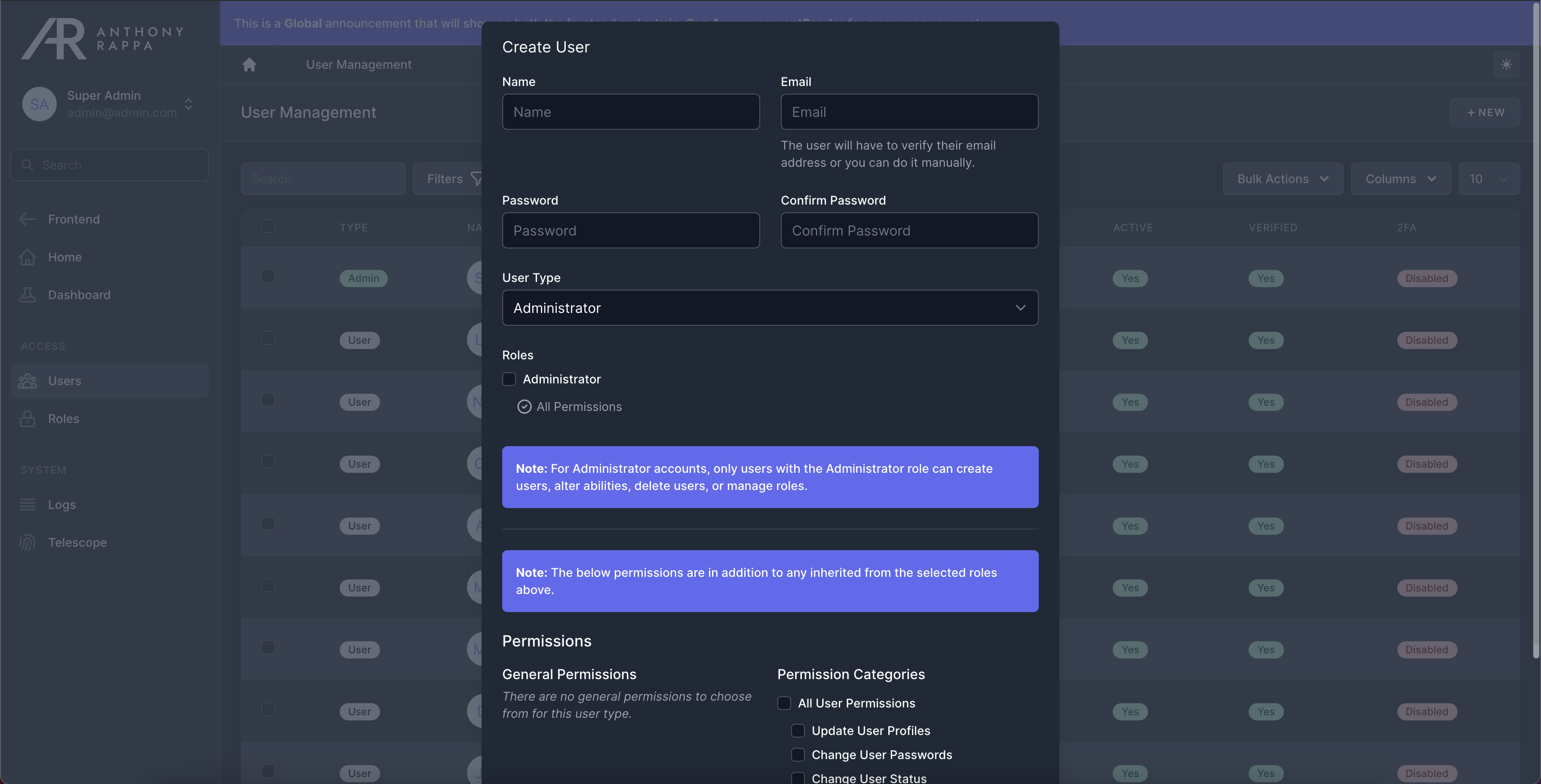
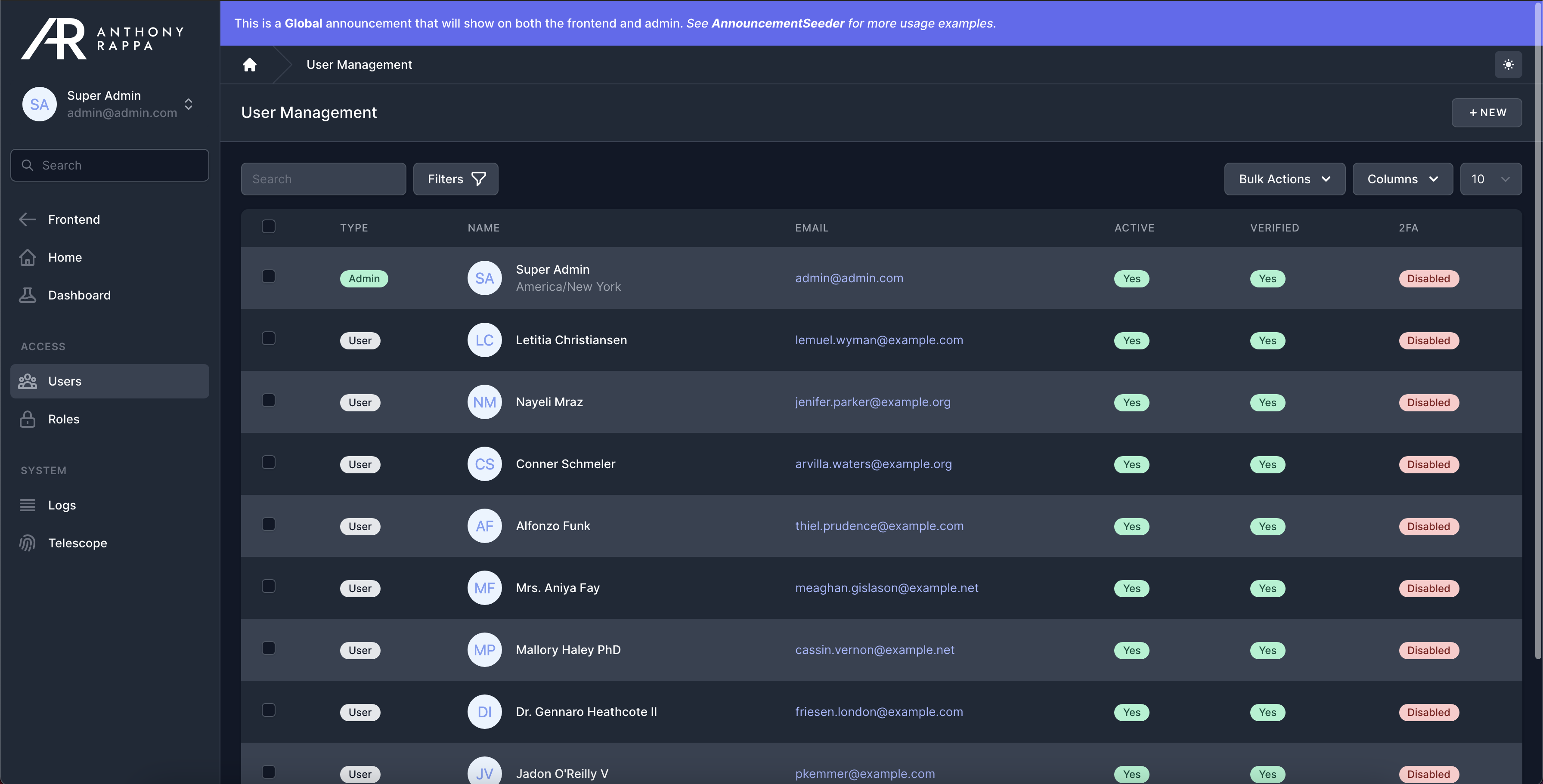
Final Result
Light:
Dark:
Modals:
Tables:
I hope you enjoyed this article! Check back soon for more.