


Extending Tailwind CSS dark mode to use system preference
In a previous article, I showed you how to use Tailwind CSS to enable a dark theme on your application. Let's take it one step further and have it prioritize the user's system theme settings first.
In a previous article I showed you how to create a theme switcher using Alpine and Tailwind.
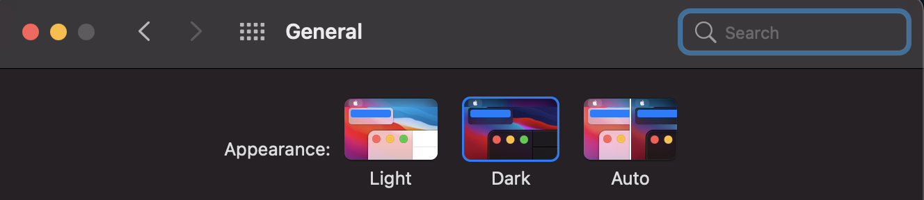
This theme switcher has a default of light and switched to dark but did not take into consideration the user's system preference for theme such as on MacOS like below:
I thought this would be a nice feature-add as I like when websites I visit take my preferences into consideration.
It was pretty easy to implement, I just had to change a few spots.
Previously, this was the code in my master template that was controlling adding the dark class to my body:
1<html2 x-data="{darkMode: localStorage.getItem('dark') === 'true'}"3 x-init="$watch('darkMode', val => localStorage.setItem('dark', val))"4 x-bind:class="{'dark': darkMode}"5>After modifications for taking the user's system preference into consideration it looks like this:
1<html2 x-data="{currentTheme: localStorage.getItem('theme') || localStorage.setItem('theme', 'system')}"3 x-init="$watch('currentTheme', val => localStorage.setItem('theme', val))"4 x-bind:class="{'dark': currentTheme === 'dark' || (currentTheme === 'system' && window.matchMedia('(prefers-color-scheme: dark)').matches)}"5>So basically the changes are:
- Instead of the
darkModevariable (which is now called currentTheme) being based solely off of thedarklocal storage item, it is based off of thethemelocal storage item and if that doesn't exist it is being defaulted tosystem. - Instead of adding the
darkclass to the html tag using thedarkModeboolean, it adds it if thecurrentThemeisdarkor if thecurrentThemeissystemand the user prefers a dark theme.
So that takes care of adding the class to the document, but what about the theme switcher.
This was the theme switcher before:
1<button x-cloak x-on:click="darkMode = !darkMode;">2 <x-heroicon-s-moon x-show="!darkMode" class="p-2 ml-3 w-8 h-8 text-gray-700 bg-gray-100 rounded-md transition cursor-pointer hover:bg-gray-200" />3 <x-heroicon-s-sun x-show="darkMode" class="p-2 ml-3 w-8 h-8 text-gray-100 bg-gray-700 rounded-md transition cursor-pointer dark:hover:bg-gray-600" />4</button>And this is the theme switcher after modification for system preferences:
1<div x-cloak class="flex items-center"> 2 <button x-show="currentTheme === 'dark'" x-on:click="currentTheme = 'system'"> 3 <x-heroicon-s-moon class="p-2 ml-3 w-8 h-8 text-gray-100 bg-gray-700 rounded-md transition cursor-pointer dark:hover:bg-gray-600" /> 4 </button> 5 6 <button x-show="currentTheme === 'light'" x-on:click="currentTheme = 'dark'"> 7 <x-heroicon-s-sun class="p-2 ml-3 w-8 h-8 text-gray-700 bg-gray-100 rounded-md transition cursor-pointer hover:bg-gray-200" /> 8 </button> 9 10 <button x-show="currentTheme === 'system'" x-on:click="window.matchMedia('(prefers-color-scheme: dark)').matches ? currentTheme = 'light' : currentTheme = 'dark'">11 <x-heroicon-s-cog x-show="! window.matchMedia('(prefers-color-scheme: dark)').matches" class="p-2 ml-3 w-8 h-8 text-gray-700 bg-gray-100 rounded-md transition cursor-pointer hover:bg-gray-200" />12 <x-heroicon-s-cog x-show="window.matchMedia('(prefers-color-scheme: dark)').matches" class="p-2 ml-3 w-8 h-8 text-gray-100 bg-gray-700 rounded-md transition cursor-pointer dark:hover:bg-gray-600" />13 </button>14</div>This ended up being a lot more in terms of code, but functionality is pretty simple:
- Instead of using 1 button and switching the icon, we use 3 different buttons for clarity.
- We show the buttons based on the
currentTheme - If the
currentThemeissystem, we change the colors of the icons to match the current system theme.
The last thing to do was change which logos were being shown based on the theme.
The original code looked like this:
1<img x-cloak src="{{ asset('img/logo.svg') }}" :class="{'hidden': darkMode}" {{ $attributes }} alt="{{ appName() }}" />2<img x-cloak src="{{ asset('img/logo-white.svg') }}" :class="{'hidden': !darkMode}" {{ $attributes }} alt="{{ appName() }}" />And the updated code looked like this:
1<img x-cloak src="{{ asset('img/logo.svg') }}" :class="{'hidden': currentTheme === 'dark' || (currentTheme === 'system' && window.matchMedia('(prefers-color-scheme: dark)').matches)}" {{ $attributes }} alt="{{ appName() }}" />2<img x-cloak src="{{ asset('img/logo-white.svg') }}" :class="{'hidden': currentTheme === 'light' || (currentTheme === 'system' && ! window.matchMedia('(prefers-color-scheme: dark)').matches)}" {{ $attributes }} alt="{{ appName() }}" />Nearly the same, with a few changes:
- Instead of choosing the logo based on the
darkModevariable we base it on thecurrentThemevariable. - If
currentThemeisdarkorsystemand the user prefers dark, then we show the white logo. - If the
currentThemeislightorsystemand the user prefers light, then we show the dark logo.
That's pretty much it, now we have full support for the user's system theme, and they can choose to override it if they see fit.
Hope you learned something. See you on the next one.